|
|
Post by ticktock on Apr 25, 2008 23:37:32 GMT -5
www.neopets.com/~zaff_So many of you may know about Neopian Time Appreciation Act (NTAA)...the petition. But that's not really doing a whole lot(petitions rarely do :/). So we've started a pet page/organization that takes publicizing the NT into our own hands. Basically it's a gigantic advertisement for the neopian times. Telling people about the neopian times and it's writers and artists, but stressing how much we LOVE and need the readers, to get more people to read. We hope to accomplish this by providing a HUGE amount of buttons that link to the neopian times for people to put on their userlookups, shops, wherever, and obviously back to the main add(pet page) too. Pacmanite is currently spiffyinging up the layout, and we've had lots of people contributing buttons.  How cool would it be for the NT to be "known" and famous again?!  Here's the page: www.neopets.com/~zaff_---Original Post--- So many of you may know about Neopian Time Appreciation Act (NTAA), I think is what it's called...the petition. But that's not really doing a whole lot(petitions rarely do :/). So I want to start a pet page/organization that will take publicizing the NT into our own hands. Basically it will be a gigantic advertisement for the neopian times. Telling people about the neopian times and it's writers and artists, but stressing how much we LOVE and need the readers, to get more people to read. However, the main "point" of it will be to provide a HUGE amount of buttons that link to the neopian times for people to put on their userlookups, shops, wherever, and obviously back to the main add(pet page) too. Ok, but the snare, it that last summer my creative website design juices completely VANISHED (ugg, SO frustrating), so I really need someone to make a good layout for the web page. You will, of course be credited all over the place. I have so many ideas to put into the web pages, little physiological tricks that will make the readers see their value. But I really need a catchy web design. People don't take things seriously if they're ugly.  How cool would it be for the NT to be "known" and famous again?!  *edit* oh, also: even if you can't make a nifty layout. Post your suggestions anyhoo...what's the expression? Two minds are twice as powerful as one? no. that's not it...w/e. You know what I mean! Thanks! *edit 2* I'm still looking for a layout, even if someone volunteers one, the more options we have for the layout, the spiffier it will be. Could you also post 1 or 2 examples? So, as I said below. You don't make me a layout that I could have made myself? OH alsooo, colabs are a really great idea for this. If you know someone who does great art, it would be pretty spiffy if the top banner was hand drawn, or w/e  ok, yay, I just like doubled my post length.  ---/Original Post/---
|
|
|
|
Post by Clocky: Activity is a Thing on Apr 26, 2008 0:42:51 GMT -5
*Ears perk enthusiastically* I'll do the layout -- but it may take... *cough* up to a month, tops. [>_>] If you want, you can post on my requests thread in Music, Video and Programming so it doesn't die an untimely death!  (xDD Just a joke... [>.>]) |
|
|
|
Post by Jade on Apr 26, 2008 0:49:24 GMT -5
I already have a layout if you'd like; it was originally intended for the NT Awards site, but as Tdyans didn't really need one, you're more than welcome to have it. Take a look at it, and if you want it let me know; I'll change the title on the header image to whatever you need it to be  . www.avista.starry-sky.com/NTA/ |
|
|
|
Post by Goosh on Apr 26, 2008 8:43:42 GMT -5
:3 This sounds like a very interesting idea. Though I absolutely fail at layouts, I would enjoy being a part of this. Making buttons, maybe?
|
|
|
|
Post by ticktock on Apr 26, 2008 10:06:16 GMT -5
:3 This sounds like a very interesting idea. Though I absolutely fail at layouts, I would enjoy being a part of this. Making buttons, maybe? sure that would be great, we're gonna need, TONS of buttons, of all different sizes! PS, I lub friends! Jade, sure, I'd love to use you layout for now. Still looking for other layouts though, just fyi. Oh, and (ok, sorry to sound bleh), but if you're gonna make a layout could you post some examples? Cause it would be silly for me to get somebody else to make one that I could have made myself. |
|
|
|
Post by Clocky: Activity is a Thing on Apr 26, 2008 19:27:42 GMT -5
I don't have any examples of Pet Page layouts I've done. xD I rarely take them.
Blah, nevermind. xD
|
|
|
|
Post by Tiger on Apr 26, 2008 20:58:34 GMT -5
Sounds awesome! I can make buttons too...maybe some random graphics if you need them...I can transparentize things...*shrug*
In theory, I can make layouts...but not very complicated ones. My userlookup is about as complex as it gets XD
|
|
|
|
Post by ticktock on Apr 26, 2008 23:00:56 GMT -5
great, I've got to get the page up before I put up any buttons, or graphics up. So I mainly need a layout, but I'll get in contact with you button makers once the page is up. THANKS!
|
|
|
|
Post by Pacmanite on Apr 26, 2008 23:32:43 GMT -5
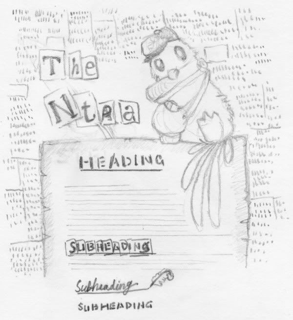
Yay! Thanks for neomailing me, otherwise I wouldn't have found this thread. I've got a rough idea down for what the layout could look like: It's basically a top banner + a repeating background, which is in this case a piece of parchment-y worn paper where all the text goes on. The background behind all of it is a collage of "newspaper clippings" (perhaps excerpts from real NT articles/stories, if I can get people's permission to use them?) that loop on each other, so they can repeat on and on. And it'll all be tinted Sepia  I like those old parchment textures. At the top is a drawing of a postal weewoo, in whatever pose, and though I really like it when the character overlaps with the text area a little, it's probably going to look better if that tail is up in its usual place rather than draped over the page... or whatever. The big title at the top's made of letters cut from real life newspapers, and the background here is also made from fake NT newspaper cuttings. I also experimented a little with headings and subheadings. I like how the font called stencil looks (I mean, once it's anti-aliased and perhaps worked over with a bit of grunge texture) and it's probably a better idea than having all the headings made from cut-up newsprint letters, though I also like the idea of having a more "classical" look to the page by having some sort of cursive font ( like maybe palace script MT) and making it look like it's just been written/underlined by the NT quill. (and excuse my horrendous handwriting o.o) Hmm... what else could I do? Maybe I should get that postal weewoo to be standing on a scrolled up end of parchment, instead of just the edge of a sheet of paper? Oooh yes, and some examples of pet pages I've done. Well, most people've already seen H33lix's comic guide... I also like the layout on Cheeroh's copyright summary, though it's a different style of scrolling, and it's not very good for showing large amounts of text. |
|
|
|
Post by ticktock on Apr 27, 2008 0:08:37 GMT -5
that is AWSOME! I'm exited! Jade, I'd still like to use your layout for a while at least, while Pacmanite gets her layout together. THANKS A BUNCH GUYS! Pacmanite, I LOVE it! I'm supper exited!!  Oh and, I have a slogan that I want on the top banner: "Most news papers record history, the Neopian Times makes history" get it?! I also had an idea that there could be a hiring message(the NT is now hiring readers), maybe IN the news paper on the top banner. and here's a very rough sketch of the text I have in mind everything in []'s are links the green links are links to the bottom of the page, where the buttons will be. ------------------------------------- decoration text: Without a reader a writer has not written without a critic an artist has not created "This page is here because I love reading the Neopian Times and think more people should enjoy it. Many writers and artists have also contributed to this page. Click [here] to see the full list. The Neopian Times used to have a link to it on the front page. It doesn’t any more, and as a result less people bother to read the Neopian Times. Leaving the intriguing articles, amusing stories, and hilarious comics left unappreciated by most. This page is here to say thank you to our current readers, and to lure potential readers into the snare of the NT. If you are an avid reader, writer, or someone who simply wants to help a good cause we have buttons for you at the bottom of this page [here] to put on your user lookup, shop, pet page, where ever you see fit that will link to the Neopian Times to help spread the word. [Get a button]
A Wise Man(you know the one everybody’s always talking about) once said, the Neopian Times is a Surprisingly well written news paper for an online gaming site. Dear readers, Picture this: A young Acara comes running up the path to his front door, skipping over the crackes (he loves his mommy) stone. He’s back from neoschool, so exited and proud about the cardboard weewoo he’s made in Mr. Lupid’s art class. He comes bursting in the front door, impatient to show his creation to his mummy. He hollers her name, hoping she’ll come running. But nobody comes. “Hello?” He whispers into what has suddenly become a dark and scary home. Nobody answers, but from the living room he can hear the TV muttering quietly to his family. Hurt, the Acara storms back out the door and stomps deliberately on every single crack. The contributors to the neopian times are still young at heart (like all neopians should be :-P), they’re the Young Acara seeking approval from his family. The unseen articles, comics, and short storys are the empty house. There are many reasons to read the neopian times. The Neopian Times provides many helpful articles that will help you be come the popular, rich, famous, *fill in desired adjective here*, neopian you want to be. If you’re comfortable with your self there are other articles to read that tell you about the short stories will provide you stimulus and amusement. While the comics will provide non-stop laughing! The neopian times has broken stories that have revealed and forever altered the course of neopia’s history, stories like, how the invisible tower became invisible, a recap and rediscovery of the lost deserts’ history, [add, I need more articles that made history]. I know you don’t want to be left out of all the wonderful things that happen in neopia. Who wants to be behind the times. Not me! Dear artists and writers, It’s a long grueling process to turn you dream or story idea into a Neopian Times worthy submission. The only reward we get is appreciation from our readers, indeed, the Neopian Times is the only contest that does not give a regular reward to its participants. As I said in the introduction neopets used to have a link to the Neopian Times on it’s front page, but with neopets 2.0 renovations TNT saw fit to remove the link. Now we must struggle to get our love, [but struggle we will!]So how can you help? There are many ways. The simplest is just taking one of the buttons we provide [here] and posting it up somewhere for others to see. If you want to get more involved you can [neomail me]. We always need more buttons, comics, quotes, and ideas. The [Neopian Times Appreciation Act] is a petition to get the Neopian Times the publicity it disserves, by putting a link to it back on neopets home page. Maybe you want to sign your name? Go [here] to do so, and learn more about it." ------------------------------------------------- please edit, add, delete and comment!  |
|
|
|
Post by Tiger on Apr 27, 2008 6:21:51 GMT -5
Oooo...I really like the layout, Pacmanite! Loving the parchment idea... Hmm...the intro is pretty good, ticktock...but it seems a little repetitive; perhaps the paragraphs could be spattered throughout the page, rather than clustered at the top? I do like your decoration text a lot though =) Just a couple grammar/punctuation/all that stuff changes...written in blue....
The comma has a question mark, because I think you're trying to have a pause there, like "You know? The one everbody's always talking about?" And I'm not sure exactly where you wanted the "quote" to start...
I'd suggest changing the "stimulus" to somelike like "excitment" or "thrills". Also, Neopian Times, as a newspaper, should be capitalized. I'll leave out any further corrections of that, because it would be obnoxious =)
Maybe you could link to stories telling just that?
The [Neopian Times Appreciation Act] is a petition to get the Neopian Times the publicity it deserves, by putting a link to it back on Neopets home page.
[/quote] [/spoiler] Sorry for being so nitpicky....XP |
|
|
|
Post by Diana on Apr 27, 2008 8:13:11 GMT -5
I'm a coding moron, and I lack much NT prowess, but this sounds pretty interesting! (And much called-for) If there's anything I can do, just ask.
|
|
|
|
Post by Goosh on Apr 27, 2008 9:40:02 GMT -5
Yay! Thanks for neomailing me, otherwise I wouldn't have found this thread. I've got a rough idea down for what the layout could look like: It's basically a top banner + a repeating background, which is in this case a piece of parchment-y worn paper where all the text goes on. The background behind all of it is a collage of "newspaper clippings" (perhaps excerpts from real NT articles/stories, if I can get people's permission to use them?) that loop on each other, so they can repeat on and on. And it'll all be tinted Sepia  I like those old parchment textures. At the top is a drawing of a postal weewoo, in whatever pose, and though I really like it when the character overlaps with the text area a little, it's probably going to look better if that tail is up in its usual place rather than draped over the page... or whatever. The big title at the top's made of letters cut from real life newspapers, and the background here is also made from fake NT newspaper cuttings. I also experimented a little with headings and subheadings. I like how the font called stencil looks (I mean, once it's anti-aliased and perhaps worked over with a bit of grunge texture) and it's probably a better idea than having all the headings made from cut-up newsprint letters, though I also like the idea of having a more "classical" look to the page by having some sort of cursive font ( like maybe palace script MT) and making it look like it's just been written/underlined by the NT quill. (and excuse my horrendous handwriting o.o) Hmm... what else could I do? Maybe I should get that postal weewoo to be standing on a scrolled up end of parchment, instead of just the edge of a sheet of paper? Oooh yes, and some examples of pet pages I've done. Well, most people've already seen H33lix's comic guide... I also like the layout on Cheeroh's copyright summary, though it's a different style of scrolling, and it's not very good for showing large amounts of text. =D That's gorgeous, Pacmanite! The Postal Weewoo looks really cute. :3 Although both the fonts are kind of distracting, and I can't even read Palace Script. xD; And I bet anyone who's in this idea will agree to have screenshots of their stories/articles/whatever used in the background. |
|
|
|
Post by ticktock on Apr 27, 2008 11:39:27 GMT -5
Thanks for the editing Tiger, I'll work on making it less repetitive. It's TRYING to be up on Zaff_'s page now, but when click preview at the bottom of the text area it takes me to the preview page, where there should be a button at the bottom that says "save changes" but it's not there. Any ideas?
*EDIT* For the contributers part of the page I'm going to put your neopets user name unless you say otherwise. Kay?
I'll also take any buttons now, PM me their urls if you've got any.
|
|
|
|
Post by Tiger on Apr 27, 2008 12:18:24 GMT -5
Most likely, the button isn't showing up because a tag wasn't closed...it's happened to my sister, and there was some image code, I believe, that wasn't closed properly.
Eek! I'll start making buttons ASAP! What size(s) do you need them?
|
|
 How cool would it be for the NT to be "known" and famous again?!
 How cool would it be for the NT to be "known" and famous again?!


 How cool would it be for the NT to be "known" and famous again?!
 How cool would it be for the NT to be "known" and famous again?!


 .
.


