|
|
Post by Deleted on Apr 29, 2007 18:46:02 GMT -5
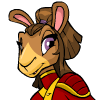
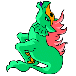
 LOL. XD  Pippi Longstockings?  They took away the Baby Grundo's diaper. >_> All in all, though, I think the Grundos look better. I really like how they did some of the Baby pets in general; the Baby Gelert is really cute now, even more so than before I think. A lot of the Darigan/Royal pets got radically changed. I do, however, like the Royal Bruces and Grarrls better now. Royal Elephantes are also quite nice. The Darigan Draik and the Royal (girl) Aisha I think got the worst revamps, personally. Both lost what made them so wonderful. The Royal Poogles and Lupes also got hit pretty bad. Basically, I feel sorry for all those Royal pets who are now on all fours. Oh yeah: the Royal (boy) Uni looks radically different now. The old one looked noble and dignified; the new one looks sort of cartoon-y. The Jetsam and Skeith look ready to attack someone. Zafaras sort of having this look to their new pose like they're going to start dancing or something. Kikos look a lot different, but I like how they look now better than before. Some people were saying Kaus are hideous nowadays, but I think they look better, too. >_> Female Quiggles look inherently angry. Faerie Buzzes no longer have pretty wings.  I miss the old MSP Poogle. Now it looks identical to the Plushie Poogle, just with a different look on its face. v_v; Most Sketch pets now look like they're made of styrofoam -- and the Snow Wocky is just plain scary.  Basically, to sum it all up, that's just a jumble of random thoughts on the revamps. |
|
|
|
Post by Reasie on Apr 29, 2007 20:42:39 GMT -5
I like the Lupe revamp (as Nim says, they got buff  ). I think the new Lutari was a mistake, but I don't have one and therefore remain unaffected.  The baby Wocky looks... demon-possessed, is the term I believe I'm looking for. My only huge complaint is the Xweetok. Fortunately, I'm able to keep Mimi, my Faerie Xweetok, in the old mid-flight pose, which is many times superior to the new style. Jerrin, my Pirate, however, has lost his peg-arm (which is something of a joke in the story I'm working on), his pose, and that expression that gave birth to his character to begin with! I like that they made the effort to let the pirate Xweetoks keep some personality; they do have a wry expression, less empty than the others, and eyebrows. But really, they went from Jack Sparrow to Will Turner, if you follow the example. *sad* |
|
|
|
Post by Kai on Apr 29, 2007 21:14:26 GMT -5
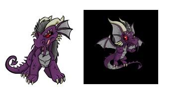
I blame the fact that Darigan Draiks having wings on that one person who brought it up in a past editorial. After I read that I sent in a request to keep the Darigan Draiks the way they were. Hmph. Do not want. *crosses arms and pouts* Seriously, which one looks better? (Thank goodness they didn't update the pics at the rainbow pool yet) Compare. The old one looked FIERCE, like Darigan pets should. The new one looks all huggable and cutesy.  |
|
|
|
Post by Deleted on Apr 29, 2007 21:28:33 GMT -5
I blame the fact that Darigan Draiks having wings on that one person who brought it up in a past editorial. After I read that I sent in a request to keep the Darigan Draiks the way they were. Hmph. Do not want. *crosses arms and pouts* Seriously, which one looks better? (Thank goodness they didn't update the pics at the rainbow pool yet) Compare. The old one looked FIERCE, like Darigan pets should. The new one looks all huggable and cutesy.  The second one's head looks disproportionately large for its body, IMHO. |
|
|
|
Post by Kai on Apr 29, 2007 21:32:27 GMT -5
I blame the fact that Darigan Draiks having wings on that one person who brought it up in a past editorial. After I read that I sent in a request to keep the Darigan Draiks the way they were. Hmph. Do not want. *crosses arms and pouts* Seriously, which one looks better? (Thank goodness they didn't update the pics at the rainbow pool yet) Compare. The old one looked FIERCE, like Darigan pets should. The new one looks all huggable and cutesy.  The second one's head looks disproportionately large for its body, IMHO. Yeah, and I'll restate my opinion on how the old one looked like a Chinese dragon made it unique.... D: |
|
|
|
Post by dragonplasma on Apr 30, 2007 10:24:49 GMT -5
Looks like Spyro the dragon the new one does ^^ I never liked the old one ...paid too much nps to have them rip off the wings xD  But dose that new draik have one less toe on his back claws? I can't stand missing body parts xD |
|
|
|
Post by Nimras on Apr 30, 2007 11:29:43 GMT -5
I'm torn on the Draiks. 1. The Darigan Draik not having wings bothered me. The one Draik who lives in the air doesn't have wings?  (Though I suppose Faerie Draiks could claim to be from Faerieland...) I can't see a Draik accepting a ride from an Eyrie friend when they could get home o their own with any other color... 2. The oversized head makes him look less ... sinister. |
|
|
|
Post by Komori on Apr 30, 2007 17:11:36 GMT -5
I think one reason the D Draik's head looks so massively large is because of those horns. They follow the earfans perfectly parallel, so then it makes it look like it's part of the fans. In fact, if they just made the horns thinner and smaller (though still wickedly curved) it would less cute and more sinister and less big-headed.
|
|
|
|
Post by jdb1984 on Apr 30, 2007 17:34:15 GMT -5
The hat on the christmas Usul just looks dumb now, and i hate that they shortened the tails on the Meerca.
|
|
|
|
Post by Deleted on Apr 30, 2007 17:44:44 GMT -5
The Usul looks all.. prissy now  |
|
|
|
Post by Ebil on Apr 30, 2007 17:53:47 GMT -5
Looking at the basic-ish colors, I rather like the Draiks as a whole o_0 I was never a big fan of their pose. It was all... weird. I never understood why so many people liked DRaiks *is pelted in veggies by Draik lovers*
Until now, though, I haven't exactly.... well, LOOKED AT any of the redraw Draiks and how they turned out >.> Looking at the Darigan Draik, I think its horns are way too big and fat =/ they're one-and-a-half times longer than their skull. it looks like they took mountain goat horns and straightened them out, then stuck them on a head that wasn't big enough.
|
|
|
|
Post by Belle on May 1, 2007 5:11:14 GMT -5
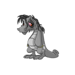
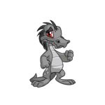
What do you guys think of the Grey Krawk revamp? OLD  NEW  I don't like the balled fist but something about the rueful expression of the revamped Krawk makes me like him.  |
|
|
|
Post by Quail on May 1, 2007 5:28:05 GMT -5
What do you guys think of the Grey Krawk revamp? OLD  NEW  I don't like the balled fist but something about the rueful expression of the revamped Krawk makes me like him.  TNT should have added the drooping 'hair' of the old grey Krawk to the revamped one. It makes them better as it is a depressed looking fella. ^-^ |
|
|
|
Post by Kai on May 1, 2007 6:52:20 GMT -5
dskjld the clenched fists are for staffs and stuff dont know if that was mentioned or not :x
|
|
|
|
Post by Deleted on May 1, 2007 11:56:57 GMT -5
Does the new Uni scream My Little Pony to anyone else? Anyway, I don't dislike them that much, except for this one:  I loved Gold Unis. Now I'm glad I didn't get one a while ago. Where are his eyes?!?! He just looks sad. Oh, and this is apparently what your Peophin looks like when it gets hurt now:  I'm going to have to stop taking my Peophin to Geraptiku just so I don't have to see that.  |
|


 ). I think the new Lutari was a mistake, but I don't have one and therefore remain unaffected.

