|
|
Post by Celestial on Mar 8, 2023 13:33:46 GMT -5
Well, shame, because that is gorgeous! I love the pose and the colour and her facial expression. Also the lighting!
|
|
|
|
Post by Breakingchains on Apr 8, 2023 22:28:30 GMT -5
Does this count as art...? Made something kinda neat: 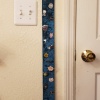  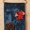 I have a bunch of pins at this point and have been wanting a way to display them all, so I made a little wall banner to pin them all to! Used some nice ribbon that matches the curtains and bedding and some copper wire that I've had tucked away ever since the house was being built lol. I'm actually pretty happy with how it came out. |
|
|
|
Post by June Scarlet on Apr 8, 2023 23:20:57 GMT -5
Ah, that is so clever! I've been collecting Neopets pins, and don't really have a good way to display them either. I've heard about using a corkboard, but then I'd lose the backings, which I need because I do wear them sometimes.
I might have to use some ribbon and take your idea and make something of my own.
|
|
|
|
Post by Breakingchains on Apr 10, 2023 8:41:40 GMT -5
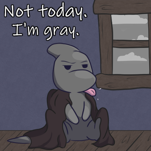 Art gallery attempt #2. In the correct size this time even lol. |
|
|
|
Post by Breakingchains on Apr 29, 2023 0:05:10 GMT -5
Didn't get this done in time for Cybunny day... oh well 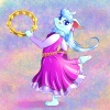 I've always thought Sasha was super adorbs and I like the way her dress came out |
|
|
|
Post by Breakingchains on Apr 29, 2023 16:47:11 GMT -5
Spriting Wezsley and turned off some layers to edit the shading. Got this weird egg. I love him  |
|
|
|
Post by Breakingchains on Apr 29, 2023 19:44:03 GMT -5
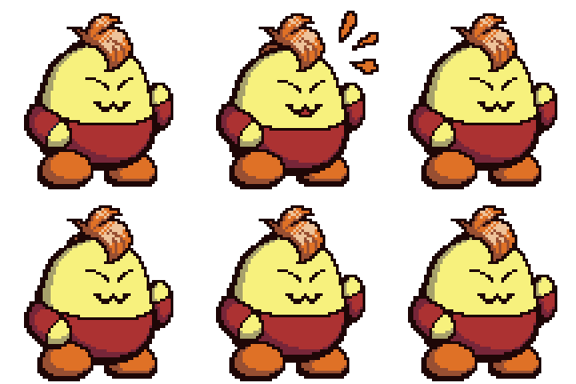 Done |
|
|
|
Post by Breakingchains on May 3, 2023 12:40:46 GMT -5
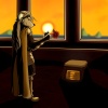 Tryna learn to draw furries + trying out some more dramatic lighting. I'm genuinely unsure how I did so hit me with your crit. |
|
|
|
Post by Breakingchains on May 3, 2023 17:41:09 GMT -5
  Blep blep |
|
|
|
Post by Breakingchains on May 7, 2023 21:35:43 GMT -5
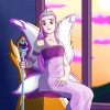 I like this one a lot. :> |
|
|
|
Post by Twillie on May 7, 2023 22:07:59 GMT -5
 Tryna learn to draw furries + trying out some more dramatic lighting. I'm genuinely unsure how I did so hit me with your crit. I'm not a furry artist myself so I probably can't give much crit on that front, but maybe I can give some helpful thoughts on the rest of it!
The mood of the piece comes across successfully even if you don't know the context of Altador's story, so dramatic lighting definitely achieved! I also like how you arranged the piece so that the flower is right next to the sun as the focal point, putting emphasis on the most important part of the piece. There's a complete story here, and I can immediately tell that the flower is significant, and then from seeing the figure's face I can assume it brings a certain unpleasant feeling or memory. Then I see the empty pedestal commemorating something, and the story of loss and grieving becomes clear.
The use of black also helps with the emotions, I always feel like stark black is fun to use with lighting! I do think there could be a larger range in darks outside of just the black, especially on the floor as it feels emptier being mostly the same midtone. Another option could also be to crop the canvas a bit more so that the borders are closer to Altador's figure and the pedestal, could tighten the focus of the piece.
I might also suggest adding reflected light to objects like the pedestal and Altador's shoes as their shapes get a bit lost in the black shadow. Reflected light happens when the light from a surface bounces onto the object resting on it, so there's still a faint amount of light in the shadowed area of said object. I think if that were added to some of the heavily shaded objects, that could help retain their shape and make them more readable.
I also love the other drawings you've been making, the animated pixel art is great! =D (And I made sure to give Wesley my vote for this week ;3)
And ooh, very pretty Fyora! The arm and hand holding the staff has great foreshadowing, and I love the color choice and shading technique for the staff itself! Good contrast of light and dark, and it creates a smooth, shiny texture like it's made of crystal or glass.
|
|
|
|
Post by June Scarlet on May 8, 2023 13:45:02 GMT -5
King Altador's dramatic shading is a lot of fun to see. I like the way you used blocks of black in the shadows, very effective.
Not a critique of your art itself, but rather the way you present it. When all you display here is a little thumbnail, it doesn't showcase your work at its best. I understand I can click on the thumbnail to make it bigger, and I usually do, but not always, and it's kind of an annoying extra step.
I would take the time to resize your work for web, say around 500-600 pixels wide, and display the full image on the forum. If you want to still share the full-quality image, you can also have the little thumbnail that leads to full-scale image, just have both.
|
|
|
|
Post by Breakingchains on May 13, 2023 19:23:39 GMT -5
Twillie: Thank you! I still have the source files and layers etc. so I'll play with some reflections and stuff to see if I can spruce it up. And yeah glass is exactly what I was going for with the staff! I've noticed it looks glasslike in some of the official art so I really pushed for that kind of texture in the shading, glad to know it comes across. June Scarlet Ahh... yeah, that makes sense. My image host just has a built-in thumbnail feature so I've been using that to avoid posting 10mb images directly onto the boards, but I guess I can see how it could get annoying, especially for those on mobile. I could try resizing for web but tbh most of my images look like a garbage fire at 600px lol, so I'm not sure what to do in those cases. Regardless, thanks for the feedback, I'll consider it.
|
|
|
|
Post by Breakingchains on May 19, 2023 18:12:43 GMT -5
Hoping this is okay to mention here--I decided it was time to open commissions. DA commission shop is here. Pricing may change later on as I'm getting a feel for things. |
|
|
|
Post by Breakingchains on May 28, 2023 23:10:37 GMT -5
First commission: Twillie 's Gibi! 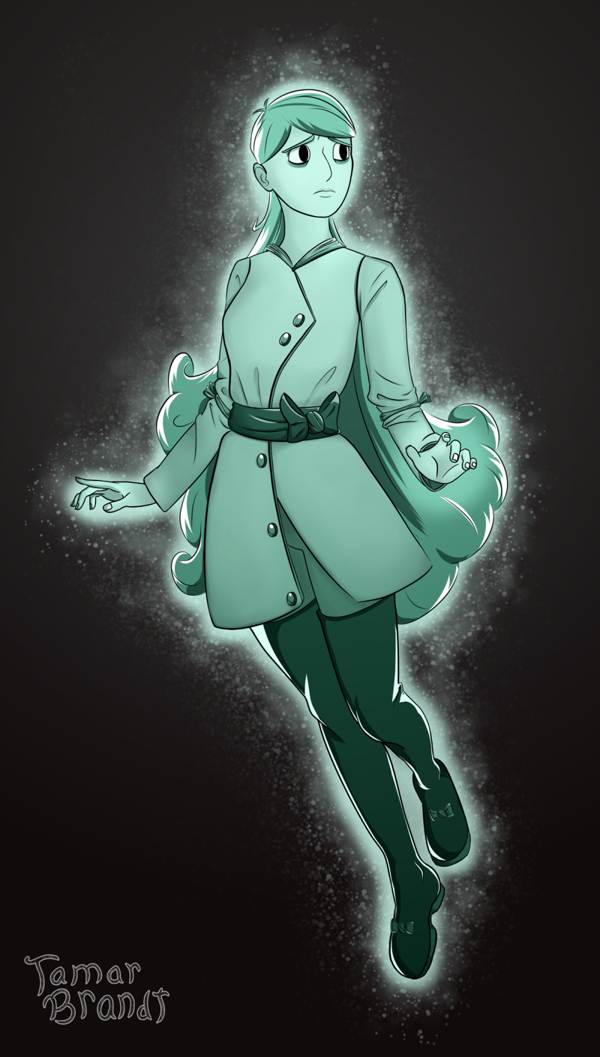 This character is super adorbs and I had a lot of fun with the glowy ghost orb effects ^^ Full size |
|