|
|
Post by Coaster on Jan 13, 2014 19:34:08 GMT -5
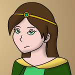
Part of the problem is I'm still not sure how to make them look different while still having them look like the characters. >_> Opinions, anyone? *must attempt to answer question and so posts off the top of my head despite that I don't know how to arting good, please take with salt and ice cream* Exaggerate body types, maybe? I've heard it in several places that a good test of unique characters is a silhouette test, where you can identify each character with incredible obviousness using only the shapes of (of course) their silhouettes. For example, Mario, Luigi, Wario, and Waluigi WALUIGI HATES THIS. WAAA are all (loosely defined) plumbers with the same basic outfit, a moustache, a pronounced nose, probably a similar age, etc. but they have very distinct shapes. Mario is somewhat round, Luigi is similar but taller/slimmer and with a different moustache, Wario is much more round with some jagged lines and more distinct creases (aka ugly butt chin), Waluigi is extremely skinny, triangular, and jagged... etc. Despite an overall common design, they're physically different enough that you could identify each one by shadow alone, and the fact that they all have the same outfit helps with that--nobody would mistake Wario for Waluigi even if the former was wearing the latter's outfit, for example. (Of course, pose and body language can also give clues, as can eyes/eyebrows and things like that. And hairstyle if it's available, especially if it's incredibly unrealistic flaming hair like on many illustrated characters.)  Bad guys on left, good guys on right. Notice that the bad guys have much more exaggerated physiques, grotesque pink noses, tiny pupils, much squintier eyes, pointy ears and shoes, sharper shapes in general, and other biologically unique features to differentiate them from the good guys. Mario and Luigi are much more similar to each other, but are still easily identifiable based on head shape, physique, moustache, etc. But, come to think of it, Mario and Co. have fairly western designs, and in their case, exaggerated means hideous, which isn't always the case. I'm not sure if you follow Yu-Gi-Oh, but there's an example of one character looking very distinguishable from, well, himself. >_> 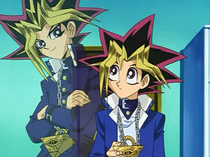 - Yami: more lightning-ish streaks in hair / Yugi: less flamboyant but still unrealistic hair, droops a little over face and at the edges of the spikes - Yami: much pointier eyebrows / Yugi: rounder, more subtle eyebrows - Yami: Pointy chin, ear slightly higher up and rounder / Yugi: Rounder face and smaller ear, which looks somewhat more childlike - Yami: very angular, sharp, square eyes, somewhat smaller on face, somewhat mean-looking, looks like he takes this children's card game very seriously / Yugi: Giant, round, googly eyes, which look very much more childlike - Yami: coat is worn in a much edgier way, with collar up, buttons closed, etc. / Yugi: coat looks a bit more casual - Yami: tall, slightly slimmer / Yugi: short, childlike - Yami: Slouching/leaning a bit, again making him look a bit more teenagey and edgy as well as making him fit into the frame better / Yugi: stands like his lightning hair is antigravity But in this case (and probably for most cases), the easiest way to tell them apart is by eyes, body type, and posture. Fictional characters don't need to follow the laws of physics or genetics. It's good for variety if most of them don't circle average height, have a healthy weight, or have the same head shape, shoulder width, a realistic chin, etc. (especially that they don't all have an equally attractive build, a trap that artists for female game characters in particular tend to fall into), but unfortunately, it's also harder on the artist because it means having to work on consistency for each character without them being as consistent with each other. Chibis (or whatever the style is called when all characters basically look like plush doll versions of themselves), smiley heads, and the like are much more forgiving and expected to look similar (and thusly be differentiable mostly by clothing, color, giant flaming hairstyle/headgear, and such), but the physical resemblance between characters shouldn't scale up when they're drawn more realistically or with more detail. Looking over some of the characters on your website, I found it hard to differentiate between General Donovan, Sanry, and Colonel Renauld when color and outfit were out of the question (other than that General Donovan has a goatee), and I think the most likely reason is they have rather normal hairstyles and share the same eye/nose/body types as most of your characters. I'd say that it would do a lot towards making your characters look different if you played with the proportions and posture a bit more (posture should reinforce character traits, and there's more than one way to stand up straight, and curved spines are not a bad thing; obese person? skinny-as-a-rail slouchy person with shoulders even smaller than hips but humongously thick legs due to bagginess of pants? even for a narrow category like real-life Olympic athlete, there are tons of options, as you've seen, as you've posted on that very board), experimented with eye types and placement (higher up, closer together, etc), retconned age to a wider range, or tried out different, less animesque (or more detailed animesque) stylistic elements. Even if it happens to look slightly ridiculous. (You can always add some crazy hair, too, to distract from the ridiculousness or at least redirect it.) If page size is an issue as far as detail goes, you can always practice drawing larger characters with more detail to get a feel for what features can be brought out more. If this sounds critical, please forgive me, but I forget how to answer a big question like that without a textwall. ._., |
|
|
|
Post by PFA on Jan 13, 2014 20:10:37 GMT -5
No, I appreciate the feedback! I totally agree with most of what you said, and I do totally want to work on differentiating my older characters more, but part of the problem is I'm not 100% certain how to do so without making them look like completely different characters. XD;
Nonetheless, I will experiment! Maybe I'll start with the three you mentioned, since they're the most obviously similar ones. :B
|
|
|
|
Post by PFA on Jan 14, 2014 18:06:41 GMT -5
I said I would sketch characters and I did!  Gen. Donovan was pretty easy, since I've drawn him a lot and have got a good feel for him already, but it was nice to break it down and figure out everything that makes him look like him. I also tried out some stuff, like giving him slightly thicker eyebrows? (Not that you can really tell with the way I sketched it, but) Sanry is definitely not one of my favorite and possibly the most developed character on my character list, what a ridiculous assertion >_> <_< Renauld was, uh... interesting, since it helped me realize the other problem I have where Renauld is extremely generic. >_>; Like he has a backstory and a fairly significant role in the plot, but he's just kind of... there, to me? Which unfortunately made it really hard to pinpoint exactly what he looks like. Nonetheless, I took the chance to try and redesign him a little. Not sure if I like the results or not? I dunno, I'll probably have to experiment some more. (And figure out how to make him more interesting to me, because now I feel bad.) Unfortunately, these three characters are actually pretty similar in multiple ways, which makes it more difficult to differentiate them. >_> They all have basically the same posture habits, for example, and that's a character thing I'm not willing to retcon. And the eyes are kind of a style thing, which I'm not really sure how to mess with? I dunno, suggestions are welcome. |
|
|
|
Post by kingjackalope on Jan 14, 2014 22:32:26 GMT -5
Hey there! Long-time lurker checking in. I'm Teow's sister, and she has shown me some of your drawings and comics. I hope that this is not rude, but I had some thoughts looking at your recent sketches that I'd like to share. Take them with a grain of salt of course, these are just my opinions. First, it is great and very important that you are working on distinguishing more between your characters! I think that only good can come of that. Of all the sketches that you posted, I'm most fond of one of your portraits of Steve. I think he came out looking pretty charming! There are just a few things about neck and jaw structure that I'd like to mention, and maybe you'll find them helpful. The first is that the neck meets the base of the skull near the bottom of the ear, and there tends to be a slight inward taper there. The second thing is that the jawline tends to start from the base of the ear, drop down into the corner of the jaw, and then continue to where the chin is defined. I wanted to mention that because the extra line and curve can provide you another way to vary faces. I played with a few other points, such as a taller ear, longer nose, and higher mouth. That is just my personal taste. You may also want to consider the placement of the clavicle, since they tend to lay lower down, a little lower than the shoulders, then curving up to meet where the arm connects. Well, I hope that was helpful. I'm sorry if I over stepped my boundaries. Thank you for sharing your art with us! |
|
|
|
Post by PFA on Jan 14, 2014 23:06:32 GMT -5
kingjackalope— Ahhh thank you <3 I really appreciate feedback! Yeah, I probably do mess up little anatomy details like that a lot, since I admittedly haven't actually studied it in detail. XD; I'll be sure to keep that in mind, thanks!
|
|
|
|
Post by Coaster on Jan 14, 2014 23:34:16 GMT -5
It looks like body type is still very similar across a lot of characters. After accounting for height differences in five characters (scaling height and width evenly for each), many characters seem to have the same (or almost the same) proportions all the way down (besides the arms, which mostly vary in muscle definition, not size). The torso and legs still make up most of your character, even though they don't stand out as much as the head, outfit, and accessories. If a lot of characters are drawn with the same basis, it can do the good of helping define your style, but have the negative effect of a lack of apparent variety. Unfortunately, it's also a step that has to be taken when the character is conceptualized, unless you give someone a massive art shift.  (the third one obviously stands out, but that's beside the point) I'm not sure where to find most of your art, though, so I'm probably overstating an observation that isn't really true. >_> |
|
|
|
Post by PFA on Jan 15, 2014 0:16:20 GMT -5
It looks like body type is still very similar across a lot of characters. After accounting for height differences in five characters (scaling height and width evenly for each), many characters seem to have the same (or almost the same) proportions all the way down (besides the arms, which mostly vary in muscle definition, not size). The torso and legs still make up most of your character, even though they don't stand out as much as the head, outfit, and accessories. If a lot of characters are drawn with the same basis, it can do the good of helping define your style, but have the negative effect of a lack of apparent variety. Unfortunately, it's also a step that has to be taken when the character is conceptualized, unless you give someone a massive art shift. View Attachment(the third one obviously stands out, but that's beside the point) I'm not sure where to find most of your art, though, so I'm probably overstating an observation that isn't really true. >_> No, you're right, I definitely have trouble varying proportions of characters without making it look weird. XD; Part of the problem is I can be aware of a number of little differences ("I seem to draw this character with a shorter waist, hrm"), but I have trouble actually making it noticeable to anyone besides me. >_> I think part of the problem is I've been working on proper human anatomy for ages now, and I'm not entirely certain how far I can go with proportions before it stops being based in reality (beyond the point that I'm comfortable breaking reality). whiiich is kind of the advice I'm looking for right now, if i'm perfectly honest here how do i make my character differences actually noticeable without making them look like bizarro country As for the location of my art, it's uh... scattered all over, I dunno. XD; Mostly on my deviantART or in the several comics on my website. |
|
|
|
Post by Coaster on Jan 15, 2014 0:48:19 GMT -5
It looks like body type is still very similar across a lot of characters. After accounting for height differences in five characters (scaling height and width evenly for each), many characters seem to have the same (or almost the same) proportions all the way down (besides the arms, which mostly vary in muscle definition, not size). The torso and legs still make up most of your character, even though they don't stand out as much as the head, outfit, and accessories. If a lot of characters are drawn with the same basis, it can do the good of helping define your style, but have the negative effect of a lack of apparent variety. Unfortunately, it's also a step that has to be taken when the character is conceptualized, unless you give someone a massive art shift. View Attachment(the third one obviously stands out, but that's beside the point) I'm not sure where to find most of your art, though, so I'm probably overstating an observation that isn't really true. >_> No, you're right, I definitely have trouble varying proportions of characters without making it look weird. XD; Part of the problem is I can be aware of a number of little differences ("I seem to draw this character with a shorter waist, hrm"), but I have trouble actually making it noticeable to anyone besides me. >_> I think part of the problem is I've been working on proper human anatomy for ages now, and I'm not entirely certain how far I can go with proportions before it stops being based in reality (beyond the point that I'm comfortable breaking reality). whiiich is kind of the advice I'm looking for right now, if i'm perfectly honest here how do i make my character differences actually noticeable without making them look like bizarro country As for the location of my art, it's uh... scattered all over, I dunno. XD; Mostly on my deviantART or in the several comics on my website. Maybe look up a bunch of shows/books/comics/etc. with vastly different art styles and draw the same character or two copying each style? It'll be easier to tell which parts are easier to emphasize in order to keep them recognizable, but you also get guidelines for experimenting. Like, Ben Caldwell's stuff is a lot different than Bill Watterson's; Link from Twilight Princess is a lot different than Toon Link from Wind Waker, but they're still recognizable based on the iconic hat and white tights and whatnot; etc. |
|
|
|
Post by PFA on Jan 15, 2014 13:22:07 GMT -5
No, you're right, I definitely have trouble varying proportions of characters without making it look weird. XD; Part of the problem is I can be aware of a number of little differences ("I seem to draw this character with a shorter waist, hrm"), but I have trouble actually making it noticeable to anyone besides me. >_> I think part of the problem is I've been working on proper human anatomy for ages now, and I'm not entirely certain how far I can go with proportions before it stops being based in reality (beyond the point that I'm comfortable breaking reality). whiiich is kind of the advice I'm looking for right now, if i'm perfectly honest here how do i make my character differences actually noticeable without making them look like bizarro country As for the location of my art, it's uh... scattered all over, I dunno. XD; Mostly on my deviantART or in the several comics on my website. Maybe look up a bunch of shows/books/comics/etc. with vastly different art styles and draw the same character or two copying each style? It'll be easier to tell which parts are easier to emphasize in order to keep them recognizable, but you also get guidelines for experimenting. Like, Ben Caldwell's stuff is a lot different than Bill Watterson's; Link from Twilight Princess is a lot different than Toon Link from Wind Waker, but they're still recognizable based on the iconic hat and white tights and whatnot; etc. I actually have tried doing exactly that before (though admittedly that's pretty old). Unfortunately, drawing in other styles hasn't really helped me figure out my own so much. XD; ...though now I have a serious question I drew these and thought that they looked beyond ridiculous, but then I showed them to Omni and the only thing she commented on was arm and leg length so... can I actually get away with drawing my characters like they're anorexic/Arnold Schwarzenegger and no one would notice, this is important to know |
|
|
|
Post by PFA on Feb 6, 2014 2:48:45 GMT -5
In completely different news, today I doodled WINGZ (by which I mean Taco stuff) (by which I mean magic Ace Attorney stuff (with some loosely implied PW spoilers if you're avoiding those)) (by which I mean TACOS GIVE YOU WIIIIINGS)  I've kind of headcanoned for a long time that phoenix!Phoenix has these really awkwardly hueg wings, which is something I think he's mentioned on occasion in regards to why he always has them hidden. :B I was never sure if I depicted that very well, though, so then I drew him next to Mia with her rarely used Light wings for comparison! And then Maya and Diego (@torkie10) showed up randomly. Wing party! I have too much fun dwelling on tiny details, though. >_> Like the Light wings being translucent, even though that was really hard to draw. And made it really hard to get all the notebook lines out of there, which I did for no particular reason. I'm obsessed with cleaning up sketches, I can't stop you guys Maybe I should make a color version of this at some point? Except I don't usually color my less detailed doodle style. Lol dunno |
|
|
|
Post by Deleted on Feb 6, 2014 8:54:09 GMT -5
In completely different news, today I doodled WINGZ (by which I mean Taco stuff) (by which I mean magic Ace Attorney stuff (with some loosely implied PW spoilers if you're avoiding those)) (by which I mean TACOS GIVE YOU WIIIIINGS) 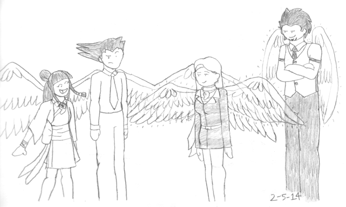 I've kind of headcanoned for a long time that phoenix!Phoenix has these really awkwardly hueg wings, which is something I think he's mentioned on occasion in regards to why he always has them hidden. :B I was never sure if I depicted that very well, though, so then I drew him next to Mia with her rarely used Light wings for comparison! And then Maya and Diego (@torkie10) showed up randomly. Wing party! I have too much fun dwelling on tiny details, though. >_> Like the Light wings being translucent, even though that was really hard to draw. And made it really hard to get all the notebook lines out of there, which I did for no particular reason. I'm obsessed with cleaning up sketches, I can't stop you guys Maybe I should make a color version of this at some point? Except I don't usually color my less detailed doodle style. Lol dunno I approve of this. :^D You should draw more stuff with Diego in it. :U *Totally not biased at all, nope*
Brain: draw them all having burgers
derp |
|
|
|
Post by PFA on Feb 6, 2014 12:34:40 GMT -5
In completely different news, today I doodled WINGZ (by which I mean Taco stuff) (by which I mean magic Ace Attorney stuff (with some loosely implied PW spoilers if you're avoiding those)) (by which I mean TACOS GIVE YOU WIIIIINGS) I've kind of headcanoned for a long time that phoenix!Phoenix has these really awkwardly hueg wings, which is something I think he's mentioned on occasion in regards to why he always has them hidden. :B I was never sure if I depicted that very well, though, so then I drew him next to Mia with her rarely used Light wings for comparison! And then Maya and Diego (@torkie10) showed up randomly. Wing party! I have too much fun dwelling on tiny details, though. >_> Like the Light wings being translucent, even though that was really hard to draw. And made it really hard to get all the notebook lines out of there, which I did for no particular reason. I'm obsessed with cleaning up sketches, I can't stop you guys Maybe I should make a color version of this at some point? Except I don't usually color my less detailed doodle style. Lol dunno I approve of this. :^D You should draw more stuff with Diego in it. :U *Totally not biased at all, nope*
Brain: draw them all having burgers
derp maybe I will, Tork maybe I will |
|
|
|
Post by PFA on Feb 24, 2014 0:17:40 GMT -5
guys guys how do I trees  I kind of slapped those trees together and then mirrored them, and I think they're okay for trees, but trees are not my strong suit obvs so Anyone have suggestions on making them more treelike :'D (I might add more detail to the pic later, but it's meant to be a background anyway, so) |
|
|
|
Post by Twillie on Feb 24, 2014 19:52:15 GMT -5
I can show you the technique I use for drawing trees, and hopefully that can help with your own drawing process! :3 Just to let you know, the steps I'm going to explain are done for traditional paper drawing, and I have not tried this technique for digital art yet. I doubt that it would be a difficult transfer, and I don't know what medium you prefer to use, but I'll just say it just in case!
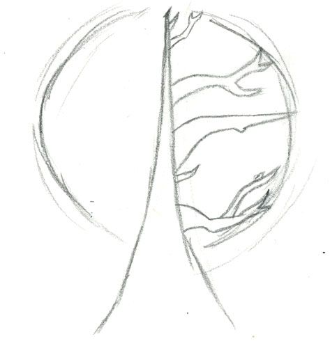
Also, this technique is for making a globe-shaped tree, where the branches form a circular shape when looking head on. There are much more tree shapes, but this is a nice and basic. Experimenting can be done on this process if trying to achieve another species of tree.
Alrighty, so for starters, a good way to get an even and straight looking tree is to draw the trunk base to top, almost like you're drawing a vertical branch, completely straight. There would be a progressive thinning to the trunk of course, and also in the picture below there's a slight bump on the trunk base before thinning upward. This helps create a more bulky base and prevents the tree from looking too thin or curvy.
Drawing the entire trunk allows for much more natural looking branches, as they won't be sticking out of what appears to be a tree made of clay. There is more evenness to the trunk, and it prevents any curving. A couple notes for the branches: don't make the branches as thick or thicker than the trunk, and make sure the branches aren't the length of or longer than the trunk. (although one branch on the right in the picture is admittedly too large and throws off the balance)
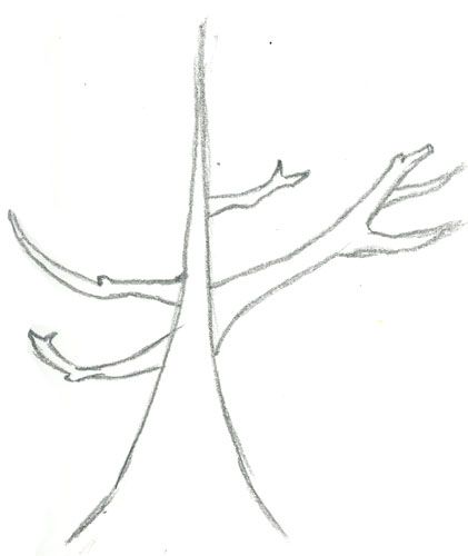
As said, this tree is circular, and it might help to put lines around the branch area so as to make sure no branches stick out too far or too short. A common mistake is when people make the branches progressively longer and thicker the higher they go. This is not usually the case, as the pattern goes short and thin, thicker and longer, and then back to short and thin.
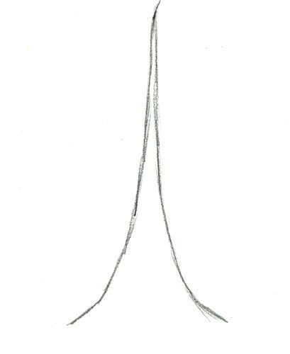
Also, if ever having trouble with curvy, unnatural branches, this is how I usually draw more jagged objects at first:
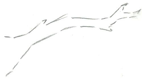
Each angle doesn't connect at first, as I don't make the branch in one line. This helps rid of any curving and adds a more authentic look (the lines can be connected after an adequate shape is made for the branch).
I hope that helps with any future trees!  |
|
|
|
Post by PFA on Feb 25, 2014 1:12:37 GMT -5
Thanks for the advice! Yeah, I do kind of tend to just slap branches on a trunk made of clay, as you put it. XD I'll have to experiment with it. :3
|
|