|
|
Post by Deleted on Sept 7, 2009 1:12:58 GMT -5
 GUILYMPICS 2009 GUILYMPICS 2009
Logo Design Contest[/b][/color][/center] Yep, thats right, the Guilympics needs an awesome logo and we'll give some points and a shiny medal (when we get them) to anyone willing to step up. You can sign up by posting on this thread and then start working on it straight away. We'll wait until everyone who signed up has completed and posted their logo and then a poll will be set up to let everyone judge which is the best. 10 Guilympics points will be awarded for every vote you receive and, when we do get some nice shiny medals, the three with the most votes will be awarded gold, silver and bronze respectively. Note that, while the logo is your creative territory, it is for the Guilympics and so should revolve around the guilds and/or creativity. This is not a contest of the best artist, but rather the best idea. Furthermore, the winner's logo will become the official logo of the Guilympics and will be displayed as part of the header for every Guilympics thread! Please also note that your logo should not exceed 500px squared, although you can always start with a larger canvas and resize later. Other than this, there is no specification for size, as long as it isn't TOO tiny. So what are you waiting for? EVENT CLOSED
Results 1st: Allianne (Michelle) - Mages - 350 Points2nd: Celestial - Mages - 100 Points3rd: Sarinon (Sarn) - Steampunk - 50 PointsContest Information Signups: Closed Ending Date: 2nd October at 7:00pm NST Judges: Poll Medals: Yes Points: 10 for every vote received. Entrants: Celestial - Mages Allianne (Michelle) - Mages Sarinon (Sarn) - Steampunk |
|
|
|
Post by Deleted on Sept 7, 2009 1:50:13 GMT -5
Question. Since the general NTWF population will be voting on this, can judges participate for this particular contest?
|
|
|
|
Post by Deleted on Sept 7, 2009 2:10:19 GMT -5
Question. Since the general NTWF population will be voting on this, can judges participate for this particular contest? Yes. ^_^ Judges can opt into any contest they like and I will shuffle the judges around to ensure that this is possible. We want as many participants as we can get. :3 |
|
|
|
Post by Deleted on Sept 10, 2009 2:06:35 GMT -5
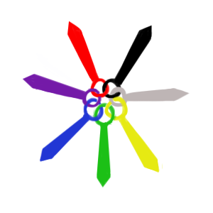
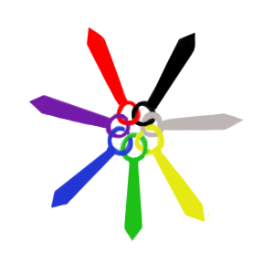
Here's a logo. It's not symmetrical, but given that I did this mostly freehand, let's pretend it is. ^^ I had more complicated ideas at first, but I've simplified it now and made it symmetric, welcoming all guilds as different but equal. Colors were kinda hard to choose, but there they are. The symbols themselves are blades with rings that join in an eternal circle, representing both the fighting spirit of each guild but also how they all stand together. Rotate it any way around and only the colors change. The colors were what I finally decided on when I found that it was really hard to definitively assign a single color, gem, element, or similar thing to any particular guild. They're very, very open to interpretation--this is just how I see it. Red: For the Pirates, representing boldness and bravery (as well as rubies and treasure, if it so pleases ^^) as well as passion and strength. Yellow: For the Mercenaries, representing gold, as currency and payment but also as a valued metal and a strong, shining color. Silver: For the new Steampunk guild, representing steel, silver, and various other metals, as well as the silver-white color of the steam that provides the power for functioning and moving forward. Black: For the Spacefleet guild, representing the vastness of space and a stable, solid color; the silver of light, metal, and technology against black shines like a star in the night sky. Violet: For the Mages, representing magic and spirit, as well as a color that can be warm or cold and incorporates both without worry. Blue: For the Knights, representing steadfast loyalty and calmness as well as bringing or keeping peace; important, but not dark or threatening. Green: For the Ninjas, representing life and growth, tied to earth, moving and changing but at the same time remaining still and steady; balanced, in harmony, stable. (I wanted to assign Violet, Black and Blue to everything, I swear. xD This would've been slightly easier with six guilds, but steampunk is worth it.) (Plus, seven's a lucky number.) |
|
|
|
Post by Cyborg on Sept 10, 2009 6:45:53 GMT -5
I love the symbolism in each colour!  |
|
|
|
Post by Draco on Sept 10, 2009 15:54:46 GMT -5
I took one look at that design, and tried to figure out which guild the colors represented  I got 2 of them right >.> The rest not so much, but the colors the guilds you chose work right. Edit: Fixed the post a little... Apparently I posted without finishing what I was writing  |
|
|
|
Post by Deleted on Sept 10, 2009 18:51:07 GMT -5
Cyborg: Thanks. ^^
Draco: Hey, well, like I said it's up to interpretation. XD Meanings or associating things with colors is a really broad subject anyway, and gemstones and elements weren't any better. *shrugs* Ah, whatever. I just didn't want repeating colors.
In all honestly, I'd give blue to knights and pirates, purple to mages, silver to steampunk and spacefleet, black to ninjas, and gold or green to the mercenaries. *shrugs*
|
|
|
|
Post by Draco on Sept 10, 2009 19:44:50 GMT -5
I got the Purple/Mages and Yellow/Mercenaries  The rest I just failed at  |
|
|
|
Post by Deleted on Sept 14, 2009 2:49:57 GMT -5
 Ok, its a bit random, but my friend once had a charm bracelet and each charm had some sort of importance to her. She'd thread them onto the chain to remember things and places and people, so I thought why not do the same for the guilds? The circle is twisted golden thread because a single thread can easily be broken when its alone, but when woven into a rope with other fibres, it is near impossible to break. (hence why rope is usually twisted) Each of the silvery gems represents a guild. The topmost is a wand for mages, and going clockwise we have a ninja mask, a steampunk gear, a merc missive, a spacefleet rocket, the pirate cliche of skull and crossbones and the hilt of a sword for knights. I know its rather sloppy, I knew I wasn't going to get much time this week so I kinda rushed to get it done ASAP. =D |
|
|
|
Post by Deleted on Sept 14, 2009 14:32:13 GMT -5
I like this a lot better than mine. ;_;
But that's good. ^^ Nicely done, and the symbols were well-chosen.
|
|
|
|
Post by Draco on Sept 14, 2009 15:10:46 GMT -5
I like it, the only thing I see "wrong" is the Ninja Mask  Usually the mask is the only part of the ninja that is open. The rest of the face is what is usually covered, if they choose to use that form. We aren't thieves after all  Which reminds me... I'm surprised we don't have a Thief Guild  Anyways, just saying, a mask like that is kind of uncommon for a ninja. However I get what you mean in the symbolism, and I like the way it's done and the little pictures ^^ |
|
|
|
Post by Amneiger on Sept 14, 2009 22:24:11 GMT -5
I think Stal's said a few things about wanting to start a Thief's Guild, but nobody ever actually tried it.
|
|
|
|
Post by Huntress on Sept 16, 2009 11:06:10 GMT -5
I think Stal's said a few things about wanting to start a Thief's Guild, but nobody ever actually tried it. Personally I'm iffy about considering the Steampunk guild a real guild for that exact reason >> At this point it's very much still in the 'yeah, let's do this' stage, without nothing actually done. If that doesn't change, it'll sink into oblivion in a short while without becoming anything more than it is now, and as such, considering it part of the guilympics is a bit of a stretch. Which more or less goes to say that I like the logos so far, but I'm not sure how apt it is to include the steampunk symbols. Hnm. |
|
|
|
Post by Deleted on Sept 16, 2009 17:22:10 GMT -5
I think Stal's said a few things about wanting to start a Thief's Guild, but nobody ever actually tried it. Which more or less goes to say that I like the logos so far, but I'm not sure how apt it is to include the steampunk symbols. Hnm. I was a bit iffy about it too, but there was quite a bit of interest. If it does drop off, I'll remove it's scoreboard, though not sure what to do about said pretty logos. ^^ |
|
|
|
Post by Huntress on Sept 16, 2009 17:53:27 GMT -5
Which more or less goes to say that I like the logos so far, but I'm not sure how apt it is to include the steampunk symbols. Hnm. I was a bit iffy about it too, but there was quite a bit of interest. If it does drop off, I'll remove it's scoreboard, though not sure what to do about said pretty logos. ^^ Couldn't you make two versions of each logo? In your case it's really just shuffling symbols around on the rope, and Michelle's... *eyes it* would be a mite more complicated, but mostly just the issue of copypasting. *luffs her Plan Bs* |
|




 I got 2 of them right >.> The rest not so much, but the colors the guilds you chose work right.


