|
|
Post by kelpie on Aug 30, 2006 15:00:35 GMT -5
Thanks for your feedback! 1. hm... The neck is a little fat but else I can't see the problem. 2. yes I liked it that way... do you think TNT will make a problem of it? *unsure* 3. Yeah, my name is just there for this forum. Not in the pic I've send to the AG  |
|
|
|
Post by Torey on Aug 30, 2006 15:27:45 GMT -5
A drawing I made for Poogle Day.  I like it a lot but the only thing that makes me like it a little less than normal is the fact that it doesn't look too crisp and clear and is quite blurry. Or maybe my eyes are just bad XD I bet it will look a lot lot better without your name plastered all over it too  Better it be safe from art stealers though. |
|
|
|
Post by Deleted on Aug 30, 2006 15:34:09 GMT -5
Thanks for your feedback! 1. hm... The neck is a little fat but else I can't see the problem. 2. yes I liked it that way... do you think TNT will make a problem of it? *unsure* 3. Yeah, my name is just there for this forum. Not in the pic I've send to the AG 1. & 2. No, I don't think TNT will care at all. 3. Okay good, than the picture is awesome! |
|
|
|
Post by kelpie on Aug 30, 2006 16:01:41 GMT -5
Ginger... it isn't your eyes. It's the 80kb limit I just tried to make a better quality one from the original image. But it doesn't make much different. 80 kb just isnt very much  |
|
|
|
Post by Torey on Aug 30, 2006 17:15:48 GMT -5
Ginger... it isn't your eyes. It's the 80kb limit I just tried to make a better quality one from the original image. But it doesn't make much different. 80 kb just isnt very much They should make it at least 100 kb, maybe more than that. I have to make my pictures quite small if they have loads of detail. |
|
|
|
Post by Torey on Aug 31, 2006 13:02:25 GMT -5
Congrats Kamikatze! Her Kyrii Day picture made it in as a late entry! I submitted mine again too, but no such luck for me. Heh.
|
|
|
|
Post by Nina on Aug 31, 2006 14:15:32 GMT -5
Spot! Your Kyrii day picture reminds me of one of my favourite songs: Blue Oyster Cult's "Dancin' In The Ruins". "I guess I'll see you dancin' in the ruins tonight!" You should download it, and see. </late reply>
|
|
|
|
Post by Pacmanite on Sept 1, 2006 3:11:27 GMT -5
A drawing I made for Poogle Day. I don't think it's too blurry, and even if it is, a lot of pieces are deliberately blurred to make it look smoother. Very, very cute  I love tyrannians. For the most part, the anatomy is excellent. I'm not a fan of the loose folds of skin on the neck, though; if a poogle with a short neck turns its head the skin on that side would get stretched... but I'm being too picky. You shouldn't fret over slightly inaccurate anatomy As for the background, well, it's very interesting and has a nice texture. But the perspective of the ground... if the poogle is standing on a flat-ish platform, the ground/horizon line should "end" level with the spot on his hindquarters. If it's standing on the face of a hill, the horizon line would make sense where it is, but the ground hasn't quite been shaded enough like a hill. I hope that made sense. And lastly, the sky is very beautiful; like the ground it's got a wonderful texture to it. But it's so vibrant it's sort of overpowering... the sky is almost dominating the picture when the poogle should be the most interesting thing and the focus of the piece. But my favourite part about it is how it's not quite clear whether it's day or night... seems to imply that Tyrannians are unaware of passing time... OK, I've rambled on tooooo much It's coz I have an English essay to procrastinate on, that's why. |
|
|
|
Post by kamikatze24 on Sept 1, 2006 10:12:04 GMT -5
Yeah!! I did get in!! *celebrates* The quality is awful, though...  |
|
|
|
Post by Torey on Sept 2, 2006 10:58:30 GMT -5
Yeah!! I did get in!! *celebrates* The quality is awful, though... I thought the quality looked quite good myself. Bet you got plenty of fanmail for it What was your prize? EDIT:  For Draik Day |
|
|
|
Post by kamikatze24 on Sept 2, 2006 17:34:06 GMT -5
Yeah!! I did get in!! *celebrates* The quality is awful, though... I thought the quality looked quite good myself. Bet you got plenty of fanmail for it What was your prize? Naaa, I didn't get any fanmail for that... I recieved a plushie petpet paint brush, but I already have a plushie petpet :/ Ah, well, I'll sell it ;D |
|
|
|
Post by Komori on Sept 2, 2006 23:27:33 GMT -5
That's a pretty spiff pic, Ginger. ^^ I like the detail you put in the background.
Two tweaks immediately come to mind, though. You should put an outline around that hair and tiara. (I still don't understand how you can outline some things and not others. XD) And Draiks have nostrils like alligators, not dog noses.
|
|
|
|
Post by jillian on Sept 3, 2006 10:59:14 GMT -5
Ginger: Nice picture! Just a few comments.
As Komori said, the nose should be more like that of an alligator. To me, the hair looks a bit unnatural. And don't Draiks have claws? I really like the curtains and the tail. ^^
|
|
|
|
Post by Dimi on Sept 4, 2006 7:52:47 GMT -5
Here's the first pic I'm going to enter ever. 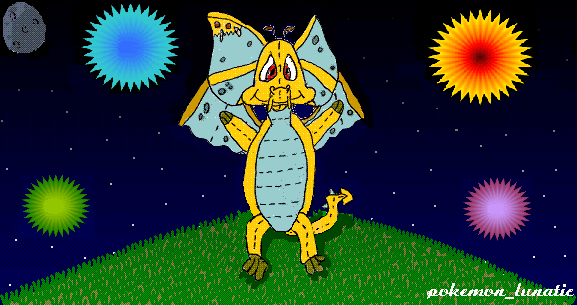 Any suggestions? I might do some shading, even though I am not sure that the moon creates shades... |
|
|
|
Post by Pacmanite on Sept 4, 2006 8:04:34 GMT -5
Ginger - I reckon that hair should be darker. The contrast of the black will make the white highlight stand out even more, making the hair look shinier. Also, you could possibly make the highlight thinner - straight hair curves around the scalp, so the highlights should be a very thin strip. When shading shiny objects, always look to see if it is curved like a cylinder or flat like a bathroom mirror. If it's the former, you'll need a thin strip of light; if it's the latter, it'll have much larger sections white. But I really, really like that tail! It's so detailed and well-proportioned and well-shaded!
...and I agree with komori, either every (important) thing should have an outline, or nothing should. Just out of curiosity, do you first colour in your picture and then draw the lineart on top?
Dimitris, I'll get back on to review your picture, and I'm sorry I can't do it now.
|
|


 Better it be safe from art stealers though.
 <---- Misty the fennec fox, thanks Sarn

 I love tyrannians. For the most part, the anatomy is excellent. I'm not a fan of the loose folds of skin on the neck, though; if a poogle with a short neck turns its head the skin on that side would get stretched... but I'm being too picky. You shouldn't fret over slightly inaccurate anatomy