|
|
Post by Dan on Feb 13, 2006 20:10:06 GMT -5
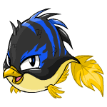
 I kind of like it. It's not my favorite, but it's not the worst. It reminds me of the Maraquan Bruce. |
|
|
|
Post by Deleted on Feb 13, 2006 20:40:18 GMT -5
Hehe, aww, it's a puffy fish! It sort of reminds me of... Flounder....  Mmm... fishes.... yum... ;_; |
|
|
|
Post by Komori on Feb 13, 2006 20:52:56 GMT -5
Heh, weird way to fishify the bird pets. But I'm seriously digging those groovy blue and black colors.  |
|
|
|
Post by Tam on Feb 13, 2006 22:20:46 GMT -5
Evil penguin fish!  I dunno, I like it! Not enough to own one, but I think the concept is pulled off well. The blue stripes are awesome against the black body and the gold fins! |
|
|
|
Post by Kengplant on Feb 13, 2006 23:32:52 GMT -5
I like the colours. It's diffrent from the usual maraquan colour scheme  |
|
|
|
Post by Ginz ❤ on Feb 14, 2006 0:07:29 GMT -5
Nice! It looks different from the other Maraquans, which in my opinion is a good thing. Shows originality.  It looks good! |
|
|
|
Post by dragonplasma on Feb 14, 2006 3:01:15 GMT -5
that would makes for some goood sushi o__o
|
|
|
|
Post by Sock on Feb 14, 2006 3:51:00 GMT -5
[glow=brown,2,300]The color combo is awesome, but it isn't my favorite mara-pet, and definetely not something I would paint my pteri if I had one.. Cute, though.[/glow]
|
|
|
|
Post by ♥ Zav on Feb 14, 2006 5:16:49 GMT -5
definitely cute, but it does remind me of the mara-Bruce... all puffy and cute ^^
|
|
|
|
Post by Gav on Feb 14, 2006 5:34:00 GMT -5
...*blink*
Very creative.
|
|
|
|
Post by Frozen on Feb 14, 2006 7:32:27 GMT -5
Creative. But I still don't like it.  |
|
|
|
Post by Huntress on Feb 14, 2006 13:00:33 GMT -5
Hehe. It's indeed creative :3 The color scheme could be better... black, blue and yellow wouldn't really be my first pick. But atleast I can tell it's a Pteri...
|
|
|
|
Post by Torey on Feb 14, 2006 19:44:43 GMT -5
Wowness! It's awesome! This is one of my faves! I love the shape of it and the colour and the eyes and...I like the whole lot!
|
|
|
|
Post by Kushbi on Feb 14, 2006 20:11:23 GMT -5
I think that it would have been more awesome if the black/blue top was orange/gold or if the yellow bottom was blue. The colour combi bothers me.
|
|
|
|
Post by Nut on Feb 17, 2006 3:45:00 GMT -5
I agree with those who have said the color combination is a bit off. Black would not have been my first pick. I like how they did the tail, and I think the face is nice, but it looks like it has blue flames on its eyes--not particularly watery.
|
|