|
|
Post by Rabbit ♠ on Oct 20, 2016 22:18:14 GMT -5
Lookie, two Dizassa drawings in a row. I'm sorry, I want more art of her for my app. What's really impressive is that I didn't sketch this one out first, either. Two in a row. I don't know why, I really should, but these are actually turning out pretty well. So here it is. 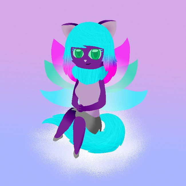 For my application, I wanted to show off a more detailed picture. By that, I mean better shading, better pose, etc. LOOK AT THAT FOOT, THAT IS A GOOD FOOT. (The one that's closer to the end of her tail, that is. The other one is mediocre at best.) I had to adjust the leg and foot at first, since they were too small to begin with (thank goodness I decided to draw on different layers this time), but this turned out pretty well. The proportions are somewhat reasonable, at least for my style. I'm pretty proud about the pose. This is the first time I did the cross-legged pose and I think it turned out well. I mean, it could be better, but I'm happy with it. |
|
|
|
Post by Zoey on Oct 21, 2016 3:17:21 GMT -5
Lookie, two Dizassa drawings in a row. I'm sorry, I want more art of her for my app. What's really impressive is that I didn't sketch this one out first, either. Two in a row. I don't know why, I really should, but these are actually turning out pretty well. So here it is. For my application, I wanted to show off a more detailed picture. By that, I mean better shading, better pose, etc. LOOK AT THAT FOOT, THAT IS A GOOD FOOT. (The one that's closer to the end of her tail, that is. The other one is mediocre at best.) I had to adjust the leg and foot at first, since they were too small to begin with (thank goodness I decided to draw on different layers this time), but this turned out pretty well. The proportions are somewhat reasonable, at least for my style. I'm pretty proud about the pose. This is the first time I did the cross-legged pose and I think it turned out well. I mean, it could be better, but I'm happy with it. Wow, just wanted to pop in and say that I am thoroughly impressed by this one!  Just look at that pose, so elegant and shiny!  Definitely better than my first attempts at a cross-legged pose. XD Man, here's hoping you finally nab that UC--I think this picture definitely deserves one. ;D |
|
|
|
Post by Rabbit ♠ on Oct 26, 2016 19:44:49 GMT -5
Aaaand I made another picture. I'm sorta on a roll with the art. Anyway, I adopted Janghwa from Winter Jewel (thanks again, BTW). So I made a pic for her. For this, I wanted to try a new sorta style, sorta anime-ish. The way I described it on the ArC was a mix of steampunk and magical girl. In the end, I sorta succeeded? Whatever, it looks nice, that's all that matters. So here it is. 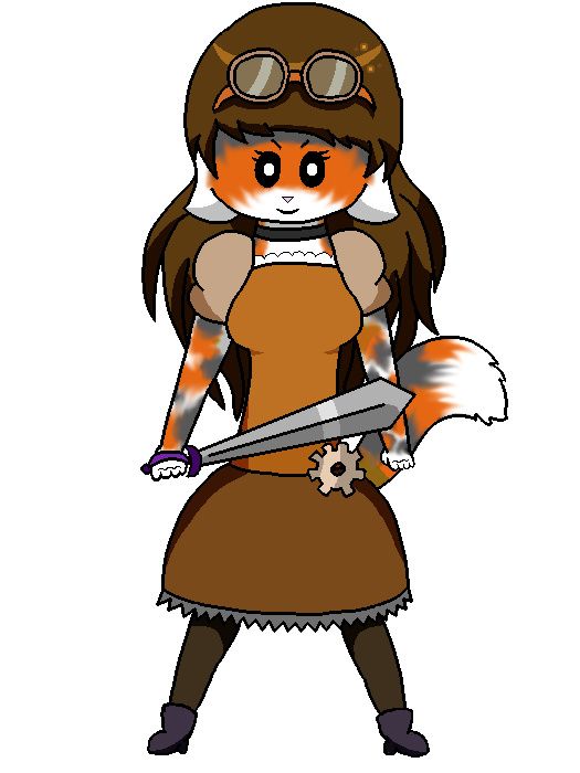 I decided to try out cell shading. Usually I prefer doing soft shading, but again, I was trying out new sorta style and I've seen lots of anime use cell shading. The boots look decent and I'm pretty proud with the hands. This is the first time I did hands in that pose (that clenching pose thing), so I'm pretty happy with how that came out. Also, I had to show you the shadings. I think it's pretty cool. 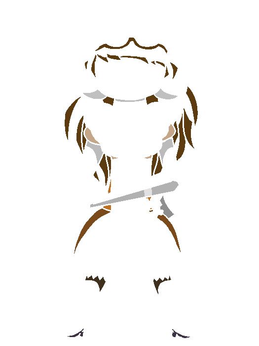 Gotta love that Multiply layer, eh? X3 |
|
|
|
Post by Rabbit ♠ on Oct 27, 2016 13:54:54 GMT -5
Yay, more Rabbit art. Okay, so I made this last night for my buddy, Liquid (who is an awesome artist, BTW. He's very talented). He wants a UC Halloween Zafara and I said I'd make art for his page. I said I was going to make it tomorrow (a.k.a. today - no, I have not started on it) since I have a really cool idea, but then I got this idea. I literally made this in like ten to fifteen minutes.  He wields a knife and is childlike, so of course he would carve a pumpkin. I literally just had to.  I'm still going to make the drawing I originally planned and I'm going to show it here. But I had to show this off first. I mean, it's cute. :x Oh yeah, Liquid likes it. |
|
|
|
Post by Rabbit ♠ on Oct 27, 2016 22:56:22 GMT -5
Oh look, two posts, one day on here. Well, I didn't make anything new. But today, one of my Art Chat buddies, Red, showed us this archive of BC entries that go back to 2014. It's really laggy, but it's really cool. Right now, we're sort of showing off our old entries. I found every picture of Remi I ever entered. So let's see how much I improved.  OH GOD, WHAT IS THAT?  THE EARS ARE MESSED UP AND THEY'RE NOT EVEN COLORED. ALL OF THE COLORING ISN'T VERY GOOD. THERE ARE PENCIL MARKS WHERE I ERASED BY THE EARS. This is pretty old. This was for the contest of March 27th, 2015, so it's over 18 months old. This was back when I was still coloring with colored pencils. I at least used the scanner. How did this earn a gold trophy? Oh... wait... Korbat... Korbat's an easy category. 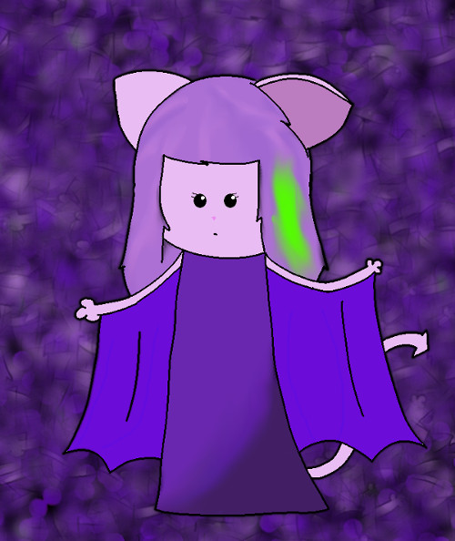 This was my first attempt at digital art with GIMP. I just drew with the mouse, no plan at first. I WANTED TO TEST THE FEATURES OUT, THIS WAS WHEN I WAS STILL SORTA NEW TO IT. This is over a year old, submitted for the 9/11/15 contest. The head is too big, the wings are awkward, the ears are just messed up, that background is not the best... *rambles on about how I do not like this* This got a bronze, somehow. 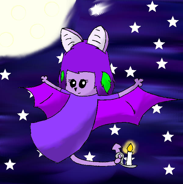 Okay, for this entry, I had been working with GIMP for a few months (this was for the 12/25/15 contest) and I was getting the hang of it. I still had those white-ish pixels near every line because I couldn't fix that at the time. The shading wasn't the best, but I was getting better. To think, I used one layer for Remi. Ha! This got a gold, but due to a glitch, the voter count reset, so I ended up only getting three votes, making Remi go on Goldban and making me really frustrated. 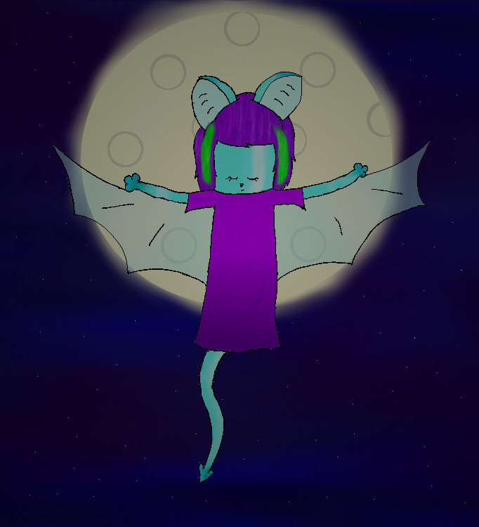 I remember when I drew this, I was like, "I WANT REMI OFF GOLDBAN, I WANT REMI OFF GOLDBAN." I entered her as soon as she was off goldban (that was for the 4/29/16 contest - goldbans last four months). During those four months, I zapped Remi ice (I was going for Stealthy, but I love her as Ice so much better). I had been getting practice with digital art, thanks to my Photography class at the time. We learned about Opacity and Masking Layers and I applied that here. That's how her wings are transparent and how it looks dark. Textures and shading obviously needed work, but I was getting there. I actually did some editing digitally, as you can tell by her left ear (it looks much different from her right). This earned me a silver and I'm not mad at that. 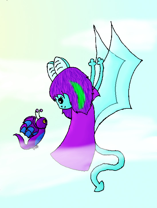 Oh look, another pic where Remi is flying. I like drawing her in the air. :T There's Somber, her Batterfly, there. Anyway, at this point (this was for the 6/10/16 contest), I was getting better at using multiple layers. I used separate layers for coloring in her wings to be transparent, I was getting the hang of textures and shading, and DAT CLOUD, THO. Also at this point, I was beginning to be more uniform with what I draw. Like her tail is (sort of) one thickness. Her ears are smaller. Her eyes are bigger. At this point, I was getting more into my current style and if you've ever seen my art, you know I like making big eyes. I didn't get a trophy for this one (she got in 5th in Korbat), but to be fair, Korbat was super crazy that week and I gave up on advertising almost immediately. 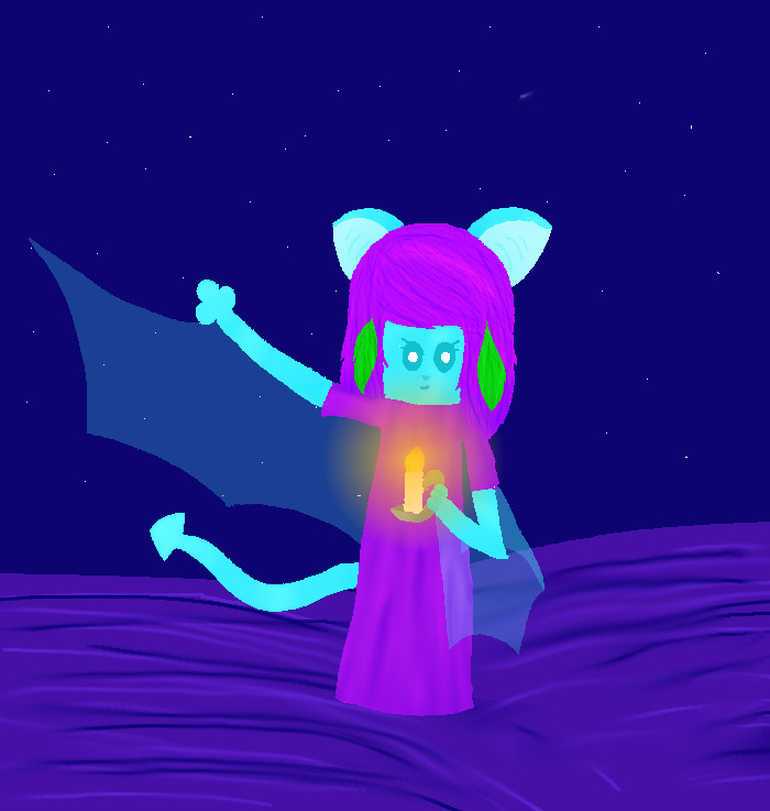 Not a month later (contest was on 7/8/16), I made this. Hey, remember when four of the Just a Couple of Writers members all entered the Beauty Contest the same week? Yes, I was one of said JCWers and I entered Remi. I was really new at lineless art (I started a bit over a week before this contest). The background needed some work. The shading could have been better. (Wait, is there shading? *looks closely* Yes, there's shading.) The cloth texture is off. Though, the wings are nice. The candle looks good. The texture in the hair is much better. Anyway, this earned me gold (she was the only Korbat that week XD) and I got 11th overall, which at the time was my highest overall placing (now has been beat by Vilinalia, who landed 10th overall sometime after, and Kayaini, who got ninth overall in the recent Circus Week Beauty Contest). Yes, the candle has been a thing with Remi and she always had purple hair with a green streak.And I've improved since then. I've gotten much better over the last few months. I've gotten much better at shading and textures and backgrounds, I'm better at drawing what I want, hands and feet are possible for me now, I know so many more techniques, my lines are so much smoother. I'm much better than I was when I started drawing Neopets. You know, Remi gets off goldban really soon... Guess I'll have to show another picture showing how much I've improved in the last four months... |
|
|
|
Post by Rabbit ♠ on Oct 28, 2016 21:34:23 GMT -5
Guys, remember yesterday when I said I was gonna make another pic of Remi because she gets off goldban soon? Yeah, just finished it. (This would be the pic that I was referring to on the Sidewalk Chalk Chatter.) 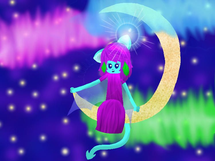 Look at it. LOOK AT IT. I am so freaking happy with this. It looks utterly amazing. Since winter is coming soon, I wanted to make a pic with the aurora borealis and of course, Remi had to be in it. I couldn't figure out a pose until I figured she could sit on the moon. The rest came easily to me. Anyway, I'm so happy with this. I decided to make the wings two toned (it might be a little hard to see since they're transparent). The moon has a rough texture (confetti shaped tool, dodge and burn, perspective option, all worked out well). I'm really happy with the shading. It really works well with the gradient flare by her ear, which I think is an awesome touch. The aurora borealis was kinda tricky, it didn't turn out exactly how I viewed it, but it looks nice. I actually looked up pictures of aurora borealis. Did you know green is the most common color for aurora borealis? It's because of the oxygen in the air. Of course, there are other colors and they're from other elements. (I knew of this before looking up the pictures, I just did research beforehand because they are so pretty.) So many layers were used in this. I think there are twelve visible layers in this picture. Of course, this picture has some problems (like the moon is stupidly shaped), but I'm overall very happy with how this turned out. |
|
|
|
Post by Rabbit ♠ on Nov 5, 2016 13:35:49 GMT -5
I GOT BORED, OKAY?? Anyway, I was bored today, so I decided to mess around with GIMP because that's what I do when I'm bored. Anyway, I wanted to play around with the Hue/Saturation tool, so I did. And I came up with this.  (The Vandagyre is owned by Neopets.com, I did not draw this. ) (I do not know how the black background came to be, I just copied and pasted.) Anyway, for those who do not know, I want the Desert Vandagyre to be a thing. So this is what I would like the desert Vanda to look like. I think it turned out pretty good. There are some spots I messed up, but it was my first time I used this tool. I did a mostly neutral body with sort of jewel tones for the tail, eye, and beak. I was going to draw clothes, but I failed at that, so here is the base. I think this took me about half an hour. It would have taken longer if I added clothing, but it didn't take as long as I thought it would. The big time consumer was selecting all the areas I wanted to change. |
|
|
|
Post by Rabbit ♠ on Nov 17, 2016 16:27:43 GMT -5
I FINISHED IT.  I FINISHED MY PIC OF TURANIN. Yeah, I'm gonna paint her faerie. Anyway, I spent a lot of time on this. It took me two days to finish. Normally I'm done in a day, two if I started late. The reason why it took so long was 1) I needed to find the perfect colors. 2) I wanted there to be patterns, not just one color per part. 3) I've been getting more into highlights and shadings. I'm really happy with this, I really am. I had no idea what to do with the tail feathers, so I messed with the dodge and burn. Then I did the same thing for everywhere else, because she is a Vanda, she has feathers, and I liked how it looked. She looks fuzzy, though, but that works, too. Gotta say, I love the jitter feature when using pencil. I used it to add the fade-y effects on Tura's arms and legs. I think I'm getting better at textures. I at least got the hair down. I went overboard on the skirt, but oh well. And don't mind the sub-par background, I am still not good at those yet and I was like, "I AM ALMOST DONE, I NEED TO DO SOMETHING." But yeah, overall, I'm so proud this. BTW: There are a total of 13 visible layers in this pic. Or more, depending on if I counted right. |
|
|
|
Post by Rabbit ♠ on Dec 3, 2016 16:41:13 GMT -5
Before I post, I would like to say I've been sketching like craaazy. I've been doing art like no tomorrow. (Considering that finals are soon, my mind might need to be on something else...) So I will be uploading more, especially when winter break rolls around. Without further ado... 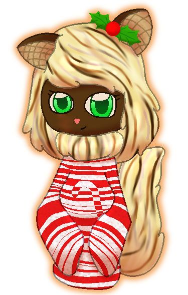 Ah, it's so good to draw Wiimsy again. This is for the Ugly Sweater Week BC. I played around with textures more and I practiced more with shading and highlights. Note to self: Use the OPPOSITE color that you used for shading when using the Divide layer. Like I use a light red in a Multiply layer for shading, so I used a light green for the highlights in the Divide layer. (I used a light red since the majority of colors are a warm tone, so I wanted to stay consistent.) |
|
|
|
Post by Tara on Dec 3, 2016 16:56:47 GMT -5
Before I post, I would like to say I've been sketching like craaazy. I've been doing art like no tomorrow. (Considering that finals are soon, my mind might need to be on something else...) So I will be uploading more, especially when winter break rolls around. Without further ado... Ah, it's so good to draw Wiimsy again. This is for the Ugly Sweater Week BC. I played around with textures more and I practiced more with shading and highlights. Note to self: Use the OPPOSITE color that you used for shading when using the Divide layer. Like I use a light red in a Multiply layer for shading, so I used a light green for the highlights in the Divide layer. (I used a light red since the majority of colors are a warm tone, so I wanted to stay consistent.) I think you've really outdone yourself. This may be you best illustration yet in my opinion. I love the shapes, shadow, and shading. You might want to do another piece like this and submit it to the AG. This is really good  . |
|
|
|
Post by Rabbit ♠ on Dec 3, 2016 22:58:30 GMT -5
Tara Thank you! I was literally watching a video on how to color today before I started on the shading and I was like, "Huh, I should try that." And I thought the holly leaf bow was a good touch - gives some contrast to the warm colors.
|
|
|
|
Post by Rabbit ♠ on Dec 10, 2016 13:38:25 GMT -5
Hey look, a WIP.  A few notes: 1) I started shading today and I am far from done, so that is why the image looks EXTREMELY FLAT. I've done this before, I know what I'm doing. (That is also why it appears that Vili has no fingers.) 2) The reason why the shading with blues is because I'm going to be adding a blue light source right over the hand. The entire background is going to be wintery and snowy, so I wanted to reflect that. 3) Those three dots are the three colors I'm using for shading. I've been doing the same with highlights. 4) THOSE FEET ARE AWESOME. Pretty much the closest I've ever been to decent looking feet. 5) There will be more of an atmosphere when I'm done. You can already tell that there will be wind. It might take a couple days to finish. It took three days for Remi's pic to be finished and I'm adding a much more complicated background and hopefully more effects for Vili here. |
|
|
|
Post by Rabbit ♠ on Dec 11, 2016 13:58:55 GMT -5
I'm done. I'm FINALLY done.  So yeah, I finished it. I practiced more on effects in this picture. Lens flare over gray layer + gradient merge (or was it extract? It's the one that makes things lighter) = really pretty light effect. There are lots of layers in this one picture. If I counted correctly, there are twenty-five visible layers. I think I did a pretty decent job with the atmosphere on this one. It looks pretty mystical, at least to me. |
|
|
|
Post by Rabbit ♠ on Dec 15, 2016 14:08:07 GMT -5
Since I officially put this on the Forum Fogey Art Fun, I can put it here. (Not really a rule, but I wanted to keep it secret.)  I won't repeat what I've said on that board, but basically this is a redraw of Remi's first BC pic. And with this, I practiced shading even more. In the end, I think it leads to a nice moody piece. I finished this picture before the Vilinalia picture in the post above this one. That would be why the Vili picture had a better utilization of effects. That and I wanted to stay true to the original picture I chose to redraw. Huh, you know, if you look at any picture of Remi I've did, even the most recent one I did in late October, you can see that I improved quite a bit. At least I think you can and I think I did. And Remi's goldban lasts until March. :'D |
|
|
|
Post by Rabbit ♠ on Dec 18, 2016 16:04:27 GMT -5
I saw @natthewriter and Zoey do a 2016 art roundup and wanted to do the same. That and this thread turns a year old on January 1st. So might as well round out the year. (These aren't in a special format because I'm on my laptop now and I don't think I can do it well with a track pad. That and I'm lazy. So all in a spoiler. Besides, I wanna show everyone the whole pictures.) January (well really December, but close enough) 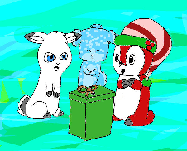 I couldn't find anything from January. :x So I went with this. This is the very first picture on this very art thread. So what better way to start? As you can tell, I didn't have a lot of experience with digital art yet, because this is pretty cringe-y. That background is stupid, if you can even call it a background. February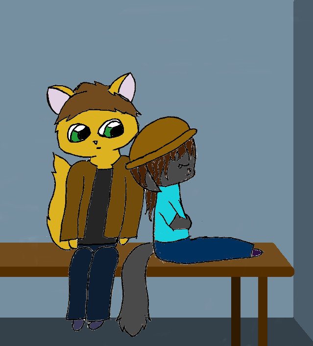 And this was when my Kanet phase started. I was practicing with poses and I got this. It's really bad, looking back on it. But hey, at least the poses are somewhat decent. March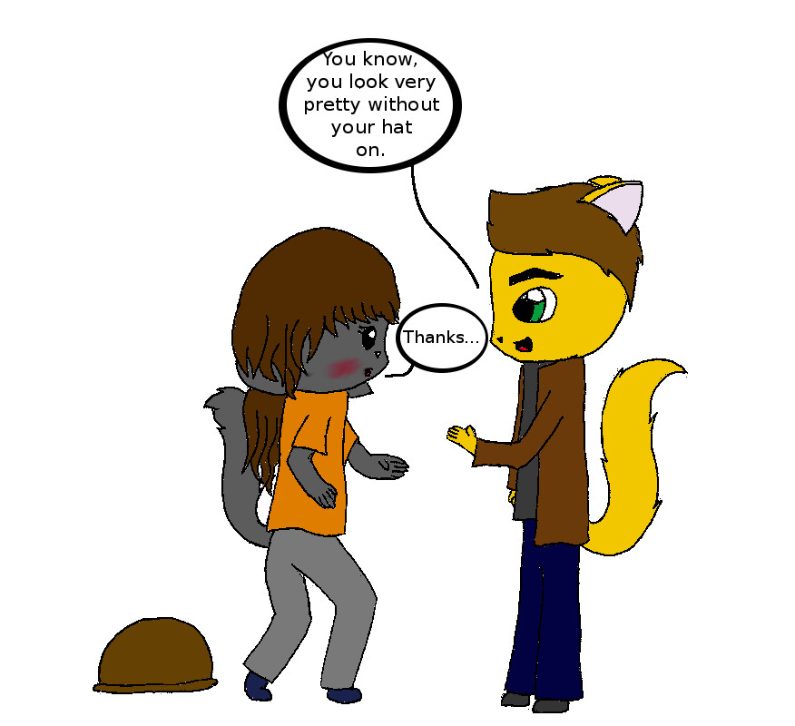 Oh look, more Kanet. (No, there's not anymore in this post. Still drawing some, but not right now.) I had quite a few pictures from March to choose from, but I chose this one for a specific reason. It's the first picture that got me drawing in the style I have today. Like, now I can (somewhat) draw hands and feet, the hair is not pasted on anybody's head, my faces are a liiittle more human-ish. Still working on that. But yeah, this was when I started working on little details like hands and hair. AprilAnd this was when I got more into effects. I actually started using layers in this picture. I played with lighting some. Most notably, I'm adding textures. They're not the best textures, but hey, it's a start. And that pose is amaaazing. X3 May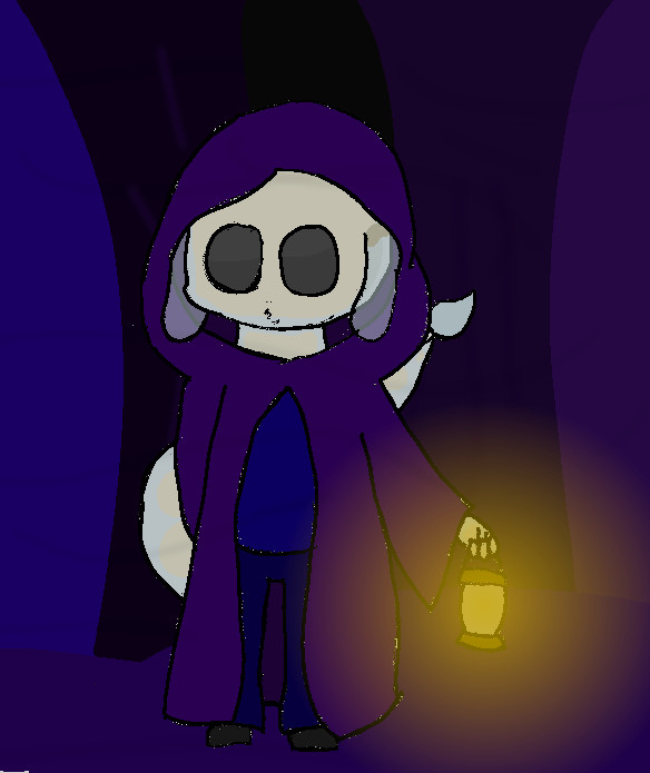 Look, more effects. I played mostly with opacity with this. This was for a friend of mine for an art trade I think. I mostly played with opacity with the transparent skin and the light of the lantern. June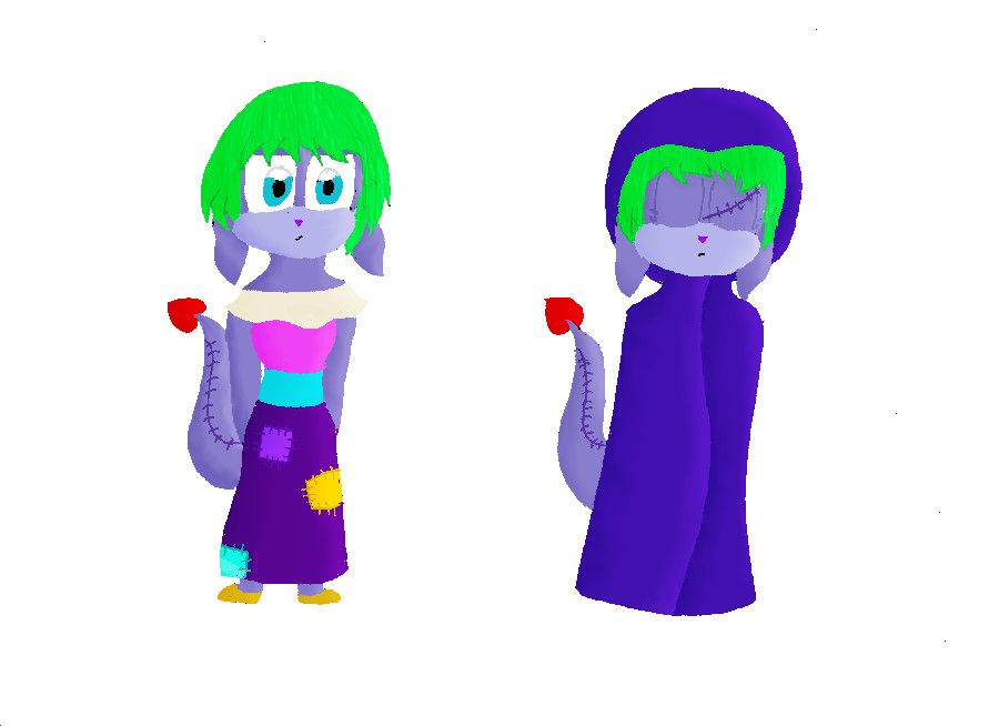 Presenting my first ever lineless art. I was applying for a UC plushie Zafara and I came up with a design. The owner didn't want art for the app, so I didn't put it on the app. Eh, the owner decided not to adopt out, anyway. But seriously, I wanted to try lineless art for a while and I decided to give it a go. I didn't have a tablet at the time and I still don't, so I had to make my own way to do lineless art. July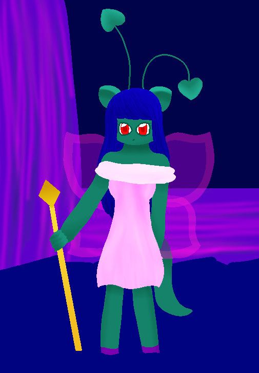 More lineless art. I got into a lineless art kick. When I started doing lineless art, I was still depending on the outline on a paper. But for this one, I did the outline on the computer with my mouse (with Smooth Stroke on, of course). I've also been doing more with backgrounds, as you can see. This was for a UC Faerie Aisha I was applying for. Didn't get that UC, either. August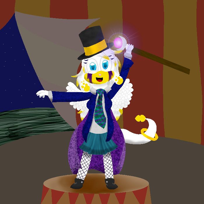 To this day, I'm still really proud of this picture. I think I created a really good scene here. This was for Circus Week back in October, but I got it done early because I got antsy and I wanted to get it done before I left for college. Back to the commentary, I focus a lot on the outfit. And I started messing with the Filter tool in GIMP. That's how I got the gradient flare. To this day, that is one of my favorite features. September I didn't do much art in September, as I started school by then. I didn't know how I was going to do art since I didn't have a scanner. So I took a picture of a sketch on my phone, emailed it to myself, and continued as normal. This is just a reference for a UC Desert Aisha. It's simple, but it's a ref. That came, tho. I like the cape. No, I do not have a UC Desert Aisha. I don't have any UCs. I'm working on that, though. OctoberAt this point, I had been working on poses and effects for a while, so I ended up with this. As you can see, I have some sort of idea of shading. The shading is somewhat in the right places, but not quite there. And the aurora borealis isn't quite the best. I somewhat got the idea across. NovemberAgain, shading, not quite in the right places. On the bright side, I got better. And I started playing with highlights. I did practice highlights before, but I started messing with it more and more. Again, poses, getting better. I spent a lot of time with the colors. I wanted them to look really nice together. DecemberYou have no idea how proud I am of this. I love this so much. I worked a lot on shading over the last couple months and I started shading with different colors. In this one, shades of blue. I started paying more attention to where light is for shading. As you can see, the shading is not heading down. I also used multiple layers for shading. A lot of layers for shading. The majority of layers in this pic are probably for shading. I worked more on textures, as the dress has a more cloth looking sort of texture, not like that silky texture I had done. Through my concentration on shading, I inadvertently worked on atmosphere, too. And that's how I learned it's all in the lighting. And I started to learn how to utilize effects better. I learned how to make the gradient flare even better. I added the lens flare, too, making a really pretty shiny effect. Multiply and Divide make really cool effects in the background. And with one more layer and a masking layer to make the snow. As you can see, I have improved over the year. Lots of people said I improved very quickly. Personally, I don't see it as very quickly. I'm just going at my own pace. Whenever I draw something, traditional or digital, I always just try to do something new. Whether it's a new pose, new technique, using a new feature in GIMP, it doesn't matter. I might be doing more than one at a time, though. It's either voluntary (such as paying attention to the details of the outfit and on the background in August) or involuntary (such as shading leading to atmosphere improvement in December). I have to say, going through all my art, it made me cringe. I chose all of these pictures for a reason. I had quite a bit to go through for some, but I put thought into why I chose these pictures. January: Beginning of the year, base to go off of February: Posing, somewhat of a background, the first of many Kanet picsMarch: Me getting into my current style, working with hands April: Lighting, opacity with the wings May: Working on effects, even more on opacity, setting June: First lineless art July: First time drawing the lines I'm using on the computer August: Setting a scene, beginning to use effects September: First digital pic without using a scanner at all (granted, I used my phone's camera, but still) October: Effects, textures, Filter effects November: Colors, highlights, shading, texture December: Shading, lighting placement, even more Filter effects, (unintentionally) atmosphere, background Now I wonder how I'll improve over the next year... Three cheers to five years for one whole year and for even more! |
|


 Just look at that pose, so elegant and shiny!
  Definitely better than my first attempts at a cross-legged pose. XD Man, here's hoping you finally nab that UC--I think this picture definitely deserves one. ;D
 I'm still going to make the drawing I originally planned and I'm going to show it here. But I had to show this off first. I mean, it's cute. :x
 THE EARS ARE MESSED UP AND THEY'RE NOT EVEN COLORED. ALL OF THE COLORING ISN'T VERY GOOD. THERE ARE PENCIL MARKS WHERE I ERASED BY THE EARS. This is pretty old. This was for the contest of March 27th, 2015, so it's over 18 months old. This was back when I was still coloring with colored pencils. I at least used the scanner.
 .
.